
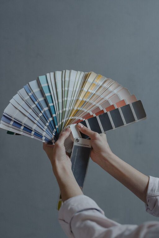
Creating a calm and peaceful atmosphere at home often starts with the colors you choose. Colors can influence mood, energy levels, and even how spacious a room feels. If you want your home to be a refuge from the hustle and bustle of daily life, choosing calm colors is a great place to start.
In this post, we’ll explore practical tips to help you pick calming colors that promote relaxation and harmony in your home.
Why Choose Calm Colors?
Calm colors are typically soft, muted tones that evoke feelings of tranquility and comfort. They can help reduce stress, improve focus, and create a welcoming vibe. Common calm colors include soft blues, greens, neutrals, and pastels.
Using calm colors effectively balances brightness without overwhelming your senses, making your space feel inviting and restful.
Tips for Choosing Calm Colors
1. Understand the Psychology of Color
Different colors can evoke different feelings:
– Blue: Often linked to calmness and serenity, blue can reduce anxiety and create a cool, peaceful space.
– Green: Reminiscent of nature, green brings balance and harmony, promoting relaxation and renewal.
– Neutrals: Colors like beige, taupe, and soft gray create a subtle background that soothes and complements other colors.
– Lavender and Soft Pinks: These gentle shades can add warmth without overpowering.
Knowing how colors influence mood helps you select hues that best fit the atmosphere you want to create.
2. Consider Natural Light
Lighting plays a huge role in how colors appear. A color that looks calm and inviting in natural daylight may feel different under artificial lighting.
– Rooms with lots of natural light can handle cooler tones like light blue or soft green.
– For spaces with limited natural light, warmer shades like creamy beige or soft peach can add coziness.
Before painting a whole room, test paint samples on the wall and observe how the colors look at different times of day.
3. Use Soft, Muted Shades
Avoid bright, intense colors when aiming for calmness. Instead, opt for muted and pastel shades that don’t demand attention but rather blend quietly into the background.
For example, instead of a bright turquoise, choose a pale aqua. Swap a vivid lime for a sage green. These softer tones help create a soothing environment.
4. Balance Color With Neutrals
Incorporate neutral tones such as white, cream, or light gray to balance your color palette. Neutrals add space, light, and breathability to a room, preventing calm colors from feeling dull or monotonous.
For instance, pairing a soft blue wall with crisp white trim or light wood floors can make the room feel fresh and airy without losing its peaceful vibe.
5. Choose Colors That Match Your Home’s Style
Think about your home’s style and existing elements. Calm colors should enhance and complement your furniture, flooring, and accessories.
– In a modern minimalist home, cooler tones like soft gray or light blue work well.
– For rustic or farmhouse decor, warm neutrals and earthy greens help maintain a natural feel.
Choosing colors that harmonize with your style creates a cohesive, intentional look.
6. Create an Accent Wall
If you want some color without overwhelming your space, consider an accent wall. Choose a calm color that stands out subtly against neutral walls.
An accent wall in soft sage green or muted lavender can add visual interest while maintaining a peaceful atmosphere in the room.
7. Think Beyond Walls: Accessories and Textiles
You don’t have to limit calm colors to your walls. Rugs, cushions, curtains, and artwork are excellent ways to introduce soothing hues.
This approach allows you to experiment with calm colors without a long-term commitment. It’s also great for layering colors for a more dynamic yet relaxed look.
8. Use Color Samples and Swatches
Always test colors before making a final decision. Paint small sections on your walls, or bring fabric and paint swatches home to see how they interact with your lighting and furniture.
This practical step can save you time and effort and help you feel confident in your color choice.
Popular Calm Color Palettes to Consider
Here are some tried-and-true calm color palettes that many homeowners love:
– Soft Blue and White: Creates a coastal, fresh, and airy feel.
– Sage Green and Cream: Brings a natural and grounded atmosphere.
– Lavender and Light Gray: Offers a gentle, elegant look.
– Warm Beige and Soft Peach: Feels cozy and inviting.
– Muted Aqua and Sand: Evokes a tranquil beach-inspired vibe.
Final Thoughts
Choosing calm colors for your home is about creating a space where you feel comfortable, relaxed, and at ease. By understanding color psychology, considering natural light, and balancing tones thoughtfully, you can transform your living space into a peaceful haven.
Remember, there’s no one-size-fits-all when it comes to color. Take your time experimenting and trust your instincts to find the calm colors that feel right for you and your home.
